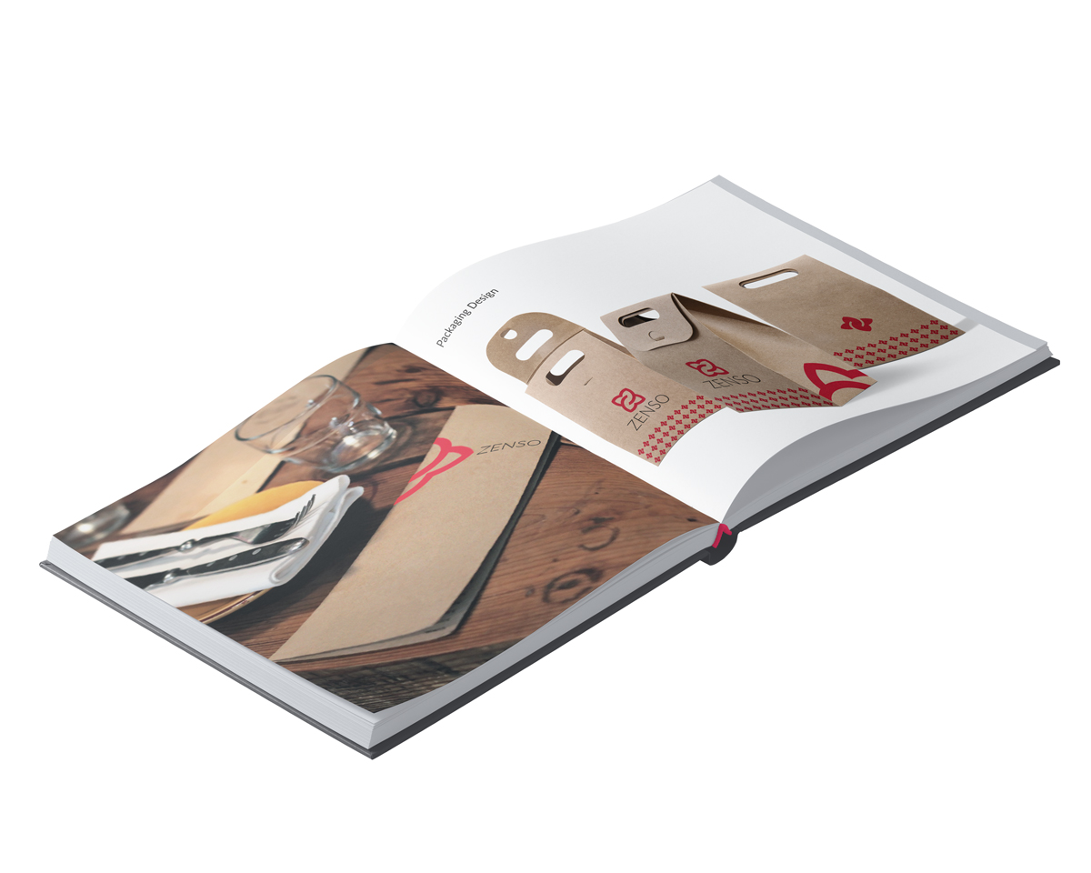
Zenso
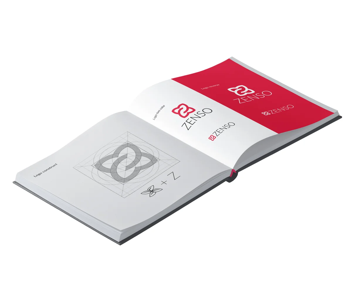
The new identity for Zenso was a play on Z and basil leafs. It is a flexible identity system that has true value and stories behind the company in a unique way. The overlapping logo shapes of the main mark represents connectivity with Thai food. The crisp typeface shows minimalism approach for Japanese essence.
